Renee Gouin, Vancouver, Canada
Renee Gouin's art expresses its depth through storytelling. There is a structure and fluidity to her work, distinctions which can also be found in her home space. Her apartment in downtown Vancouver is a space designed to offer her both inspiration and rest. We caught up with Renee to discuss her work, home life and why she thinks "curated perfection" is overrated.
What can you tell us about your home?
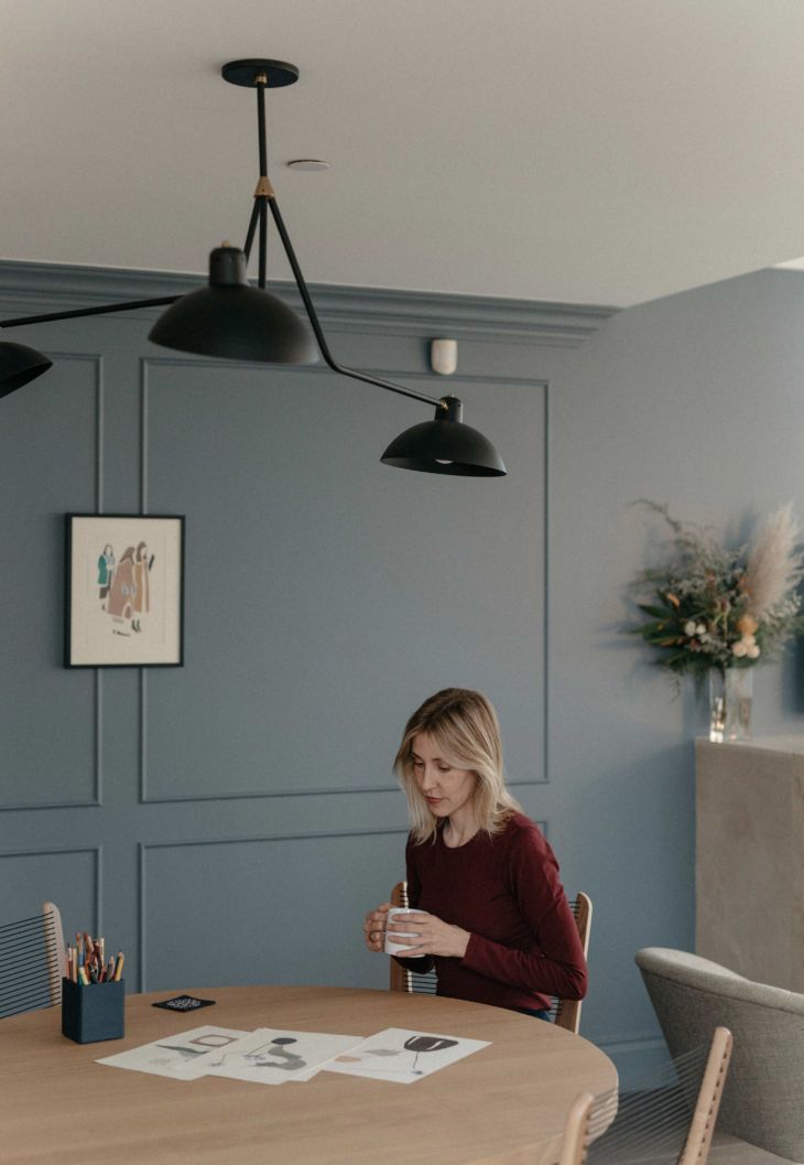
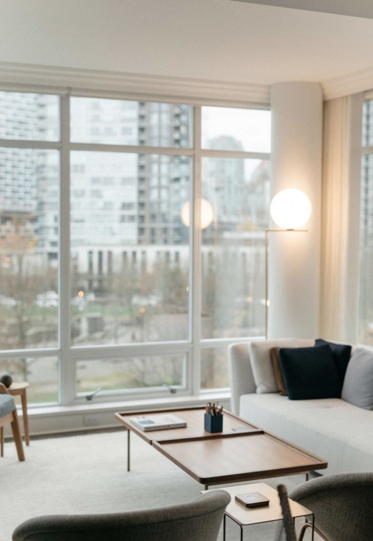
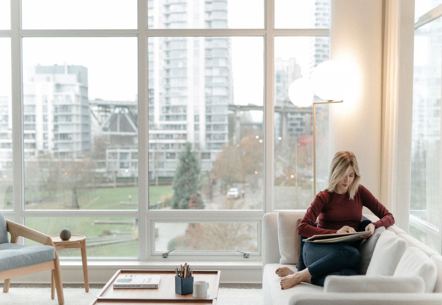
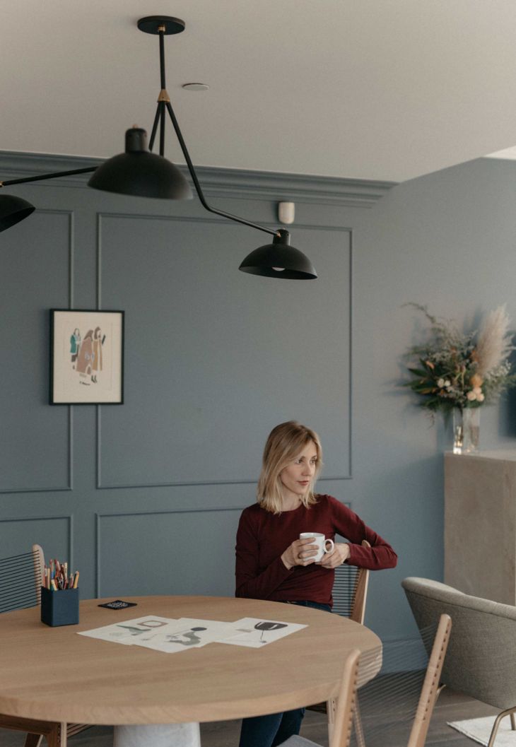
So much of my artwork focuses on the delicate interplay between modernity and femininity, and my home is really an extension of those themes. Parts are very classical, like the crown moulding and the panels we added to the long hallway as a very minimal decorative touch that makes it feel more composed and welcoming. The overall aesthetic is really cohesive. I chose a lovely grey-blue for the paint colour in the hallway, which gives it some added character, and in the other rooms, I’ve warmed it up with some light, feminine Belgian linen curtains that are incredibly soft and serene. It’s a very intimate, welcoming, peaceful space, with big, bright windows overlooking the views of the city.
What do you love about living in Vancouver?
Vancouver is an amazing place because of the breadth of experiences available to you. Here you have a truly cosmopolitan city, just minutes away from the mountains and ocean, so you never feel trapped by crowds or chaos. It’s the perfect size, filled with culture and delicious food, without the overwhelming sensation that can come from a big Metropolis.
Can you describe your neighborhood?
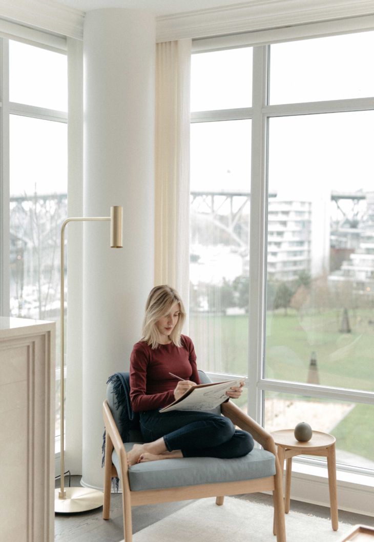
My home is in a residential area downtown, a little, off-the-beaten-path enclave with a view of the water. I live above one of the more formal and elegant parks in the city and enjoy the green open space. I go for runs on the seawall to English Bay or take the SeaBus to Granville Island. It’s bright and bustling and serene all at once.
Your work pares down to the essentials. Does this translate over into your approach to interiors?
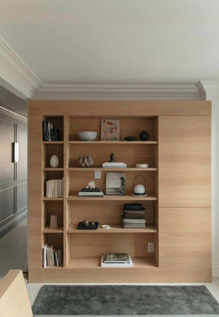
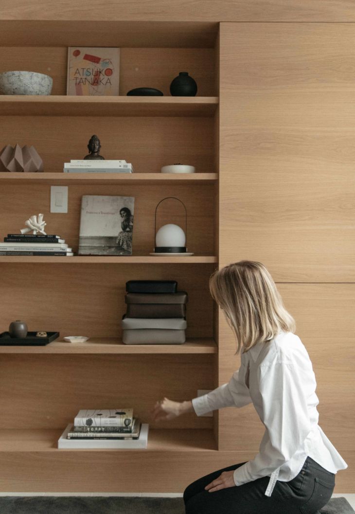
Absolutely. Serenity is important for me in my home space, so I really cherish the small, understated details that foster a sense of warmth, but in a modern, uncluttered way. I was very specific about the colour palette I chose, and I drew a lot of inspiration from my prints as I was designing the interior of my apartment, especially the muted blue-grey tones. It’s given me a neutral foundation to build on, which allows me to incorporate rich, complementary shades of ochre and sharp, black and white contrast while still maintaining that clean, minimalist feel.
Do you have a favorite object in your home, one that holds extra significance?
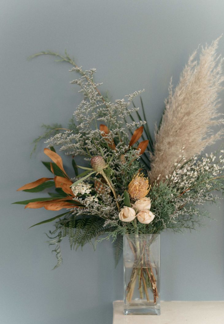
I can honestly say that I really love everything and so I find it hard to choose any one object. With that said, I always like to have fresh flowers. As an artist, I appreciate them as vivid still lifes and natural sculptures. They’re an immediate source of inspiration for me.
We love your monotypes. Have you always worked in this medium?
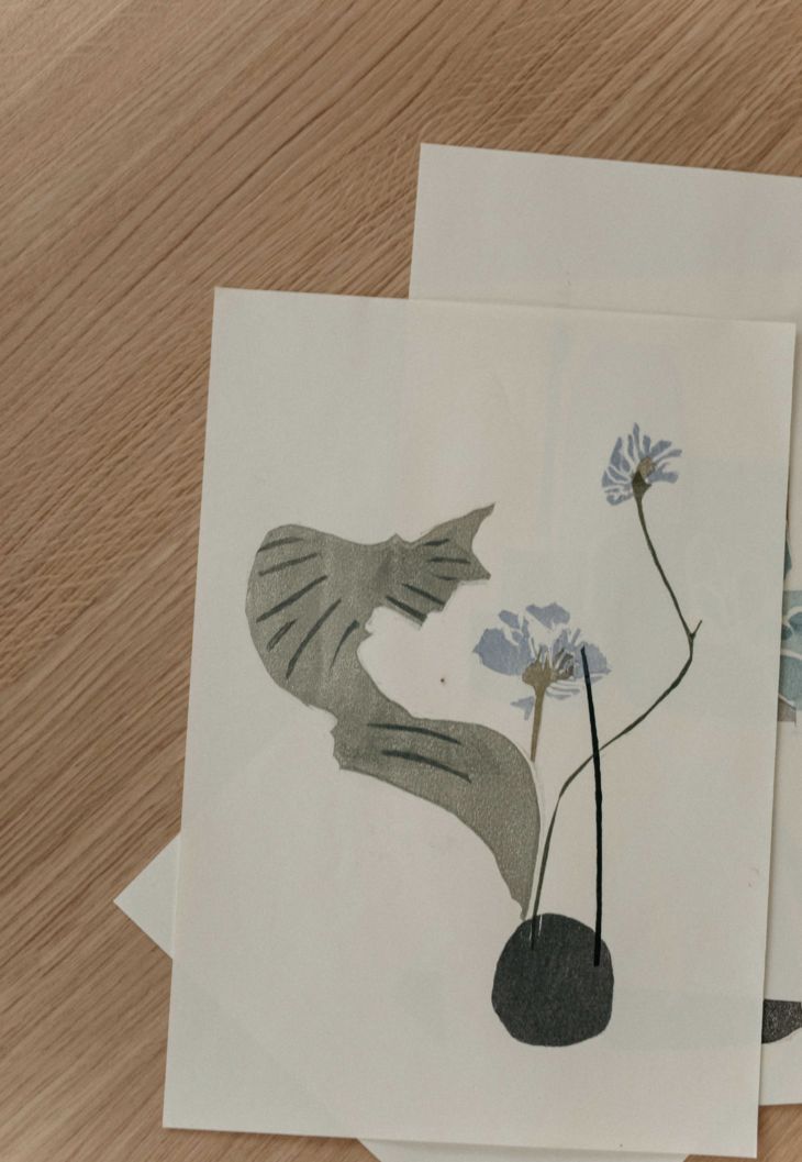
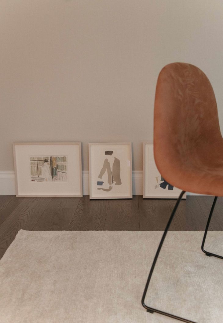
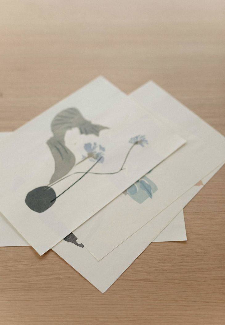
I actually only started working with this specific technique a few years ago. Before that, my work focused on watercolours and drawing. I was starting to feel dissatisfied with the ethereal diffusion the watercolours were providing, when I wanted a more substantial, saturated block of colour. I found that, by using this monoprinting technique of rolling the paint onto the plate and then forming the image, I was able to obtain richer, more dense and tactile shades, even from the lighter colours. These tones stand out in a way I could never achieve with watercolours, and I appreciate the way the technique allows little nuances around the edges and within the shapes making them more interesting and Beautiful.
Your work seems to capture this lovely feminine balance of power and softness. What has been a source of inspiration for you?
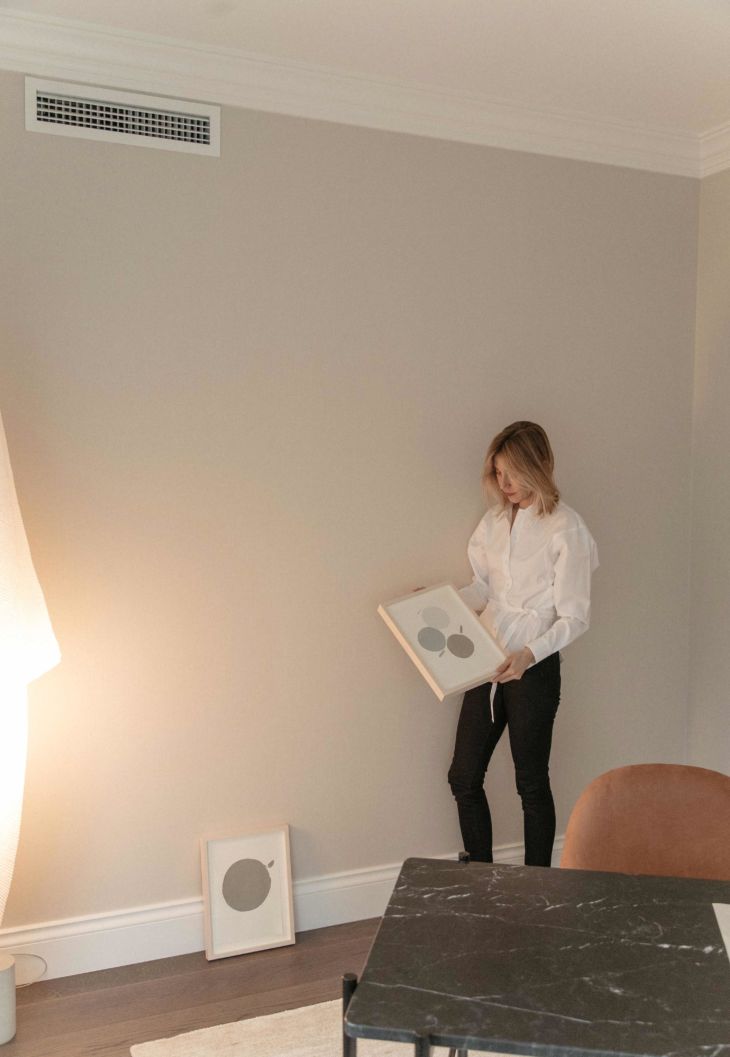
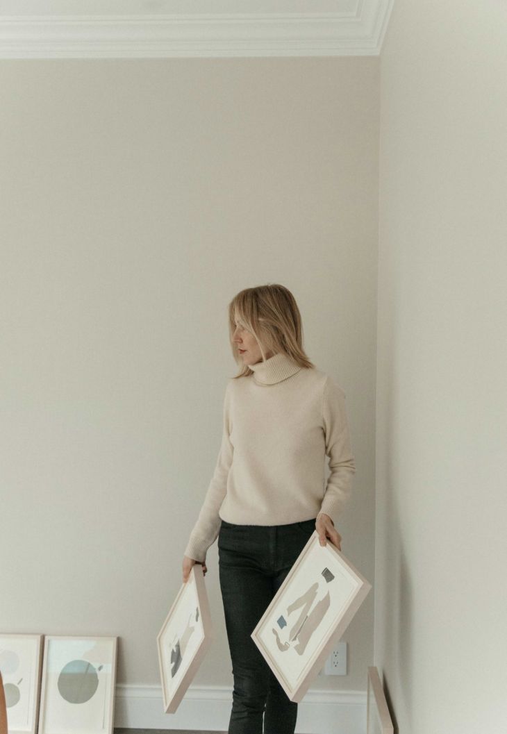
This balance between the modern and the feminine really is the core of what I do, and I find that having these two energies flowing through simultaneously ultimately helps me create more grounded, solid work. I love the combination of geometry and rich, saturated colours with the more feminine shapes and tones. I love crafting intimate portraits of women without identifying the women themselves, allowing negative space and their own dynamic gestures to tell the story. I love creating images of fashion minus materialism, using it as a vehicle to convey a sense of expression rather than consumerism. I love challenging myself to create depth — both visually and in my subject matter — using two- dimensional forms. All of these juxtapositions, for me, create an interesting tension and give me a deeper well from which to draw my inspiration. On the practical side, my artwork is inspired by Japanese woodblock prints, both the graphic design and the colour palettes they incorporate, though my technique is different. My most recent work is also inspired by the idea of reduction and exploring more restrained compositions. I respond to negative space as it accentuates the irregular contours of my monotype transfer.
In your opinion, what’s something that you feel is underrated and on the flipside, overrated?
There seems to be a pervasive sense of curated perfection. We all like to see things well put together but sometimes that can get a bit predictable. There’s something to be said for an uncurated look, with a touch of randomness and a hint of imperfection. It’s so much more pure when you allow a thing to be what it is rather than filtering it into a false sense of flawlessness.
There’s something to be said for an uncurated look, with a touch of randomness and a hint of imperfection. It’s so much more pure when you allow a thing to be what it is rather than filtering it into a false sense of flawlessness.
What’s your go to easy and comforting meal after a busy day?
Wild salmon, brown rice, and steamed broccoli. It’s delicious and easy to prepare, tastes healthy, feels healthy, minimal clean up.
Can you describe your ideal morning?
I prefer to wake up early, around 5:30 or 6, which gives me time to sit by the fireplace and sketch with a cup of coffee. Having that space set aside to contemplate helps me maintain a certain focus for my time in the studio that day.
I prefer to wake up early, around 5:30 or 6, which gives me time to sit by the fireplace and sketch with a cup of coffee.
How do you ease into the evening? Do you have any night time rituals?
I like to cook dinner with my boyfriend. He's a good cook, it's a nice shared ritual. I also enjoy winding down with a cup of tea and some quiet activities -- generally sketching, reading, or watching a film, depending on my mood.
How do you connect back to yourself? What's your non-negotiable?
Diet and exercise are key for me. Eating well, getting to the gym, or being outside and going on hikes in nature. I also need to dedicate time in the studio as a way to connect with myself and my work. Studying the colour and the shapes within my monotypes helps me to understand their impact, and this is an essential part of my printmaking process. 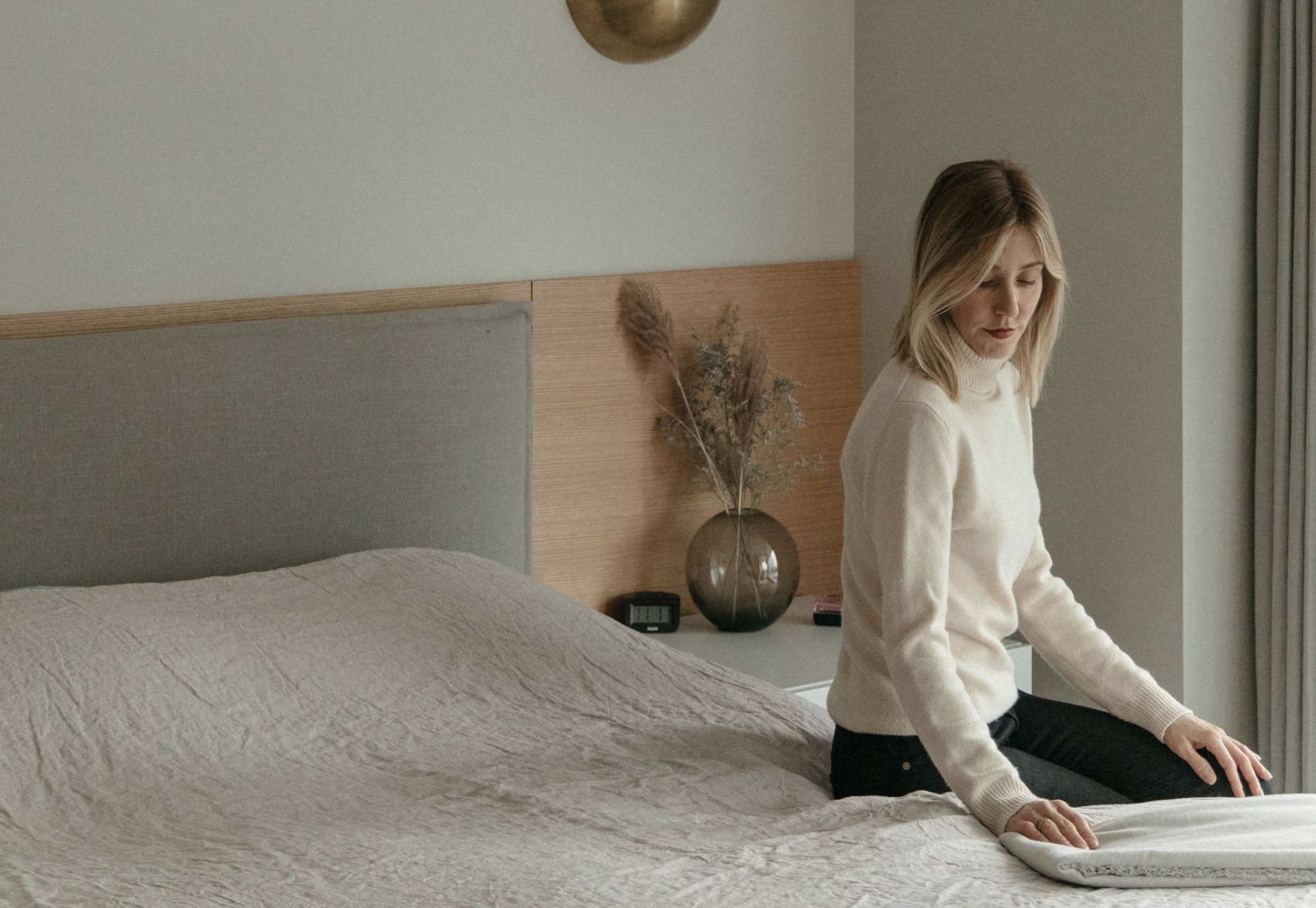 Renee relaxes in her bedroom. Featuring our dove grey__linen sheets
Last thing you read, listened to, or watched that inspired you?
Finn Juhl's book of watercolours, for his dense and saturated colours, and the uniquely organic, geometric forms of Mid-Century Modern furniture he's beautifully hand-rendered. Alessandra Fanari's book on Pierre Charpin. I was attracted to Charpin's drawings, the inventive and whimsical way he employs negative space with solid shapes. I also recently had a studio visit with a local Vancouver artist, Lyse Lemieux. She suggested that I try to be less literal in my imagery, so I'm challenging the viewer to look deeper and really connect with what they see. I resonate with Lemieux's minimal colour palette and how her work balances between figuration and abstraction.
What's your current studio soundtrack?
Right now, I'm listening to Sakura by Susumu Yokota, it sets a peaceful undertone.
What's on the horizon for you?
In the studio, I'm experimenting with larger surfaces and more abstract compositions. The studio visits have provided great feedback, giving me insights on how to expand and refine my visual language. I'm excited to show this new body of work next year.